Loadout

by Zan Laucius
Template Setup Guide
Updated June 23, 2026
Introduction
Thank you for remixing the Loadout Template by Zan Creative. This documentation is here to help you set up, customize, and get the most out of your new website. Don’t have the template yet? Remix it here.
Recommended Images
For product thumbnail images, using product image PNGs with a transparent background is recommended. Alternatively, you can use images with a plain white background. Images should can be any aspect ratio, but should be cropped as tightly as possible for consistency. If an image appears too large on the grid, set the Card Variant field to Smaller for that item in the CMS.
Note: any product you want to use as the category thumbnail on the Explore page should have a fully transparent background.

Adding a New Product
To add a new product CMS item, head to the project CMS, and select Products on the left-side panel. Click +, then begin filling out the fields, including a Name, Price, Purchase Link, and Image for each product. If the product is a Book, select Book under Card Variant to give the image a realistic book render. If your image appears too large in the grid, set the Card Variant field to Smaller for that item in the CMS.
If you want to create a deeper dive into a specific product, you can optionally add Notes about the product, as well as up to 4 additional images. To add additional images, fill in the Image 2 … Image 5 fields, and an image slideshow will be shown on the Product CMS page instead of the single product image.
Adding a New Category
To add a new Category, head to the project CMS, and select Categories on the left-side panel. Click +, then add a name for the Category. Make sure to select one product to be featured as the Cover Product using the Cover Image field. This product image will be shown on the Category Card on the Explore page.
Toggling Prices on and Off
By default, prices are shown on the product thumbnails on the Home page, as well as each of the Category CMS pages. To hide prices, select the Product Card component (within Home Page > Product Grid > Products > Product) and set Show Price to No (on the right side panel). Repeat this process on the Categories CMS page to hide prices on both pages.
Linking Directly to Purchase Website
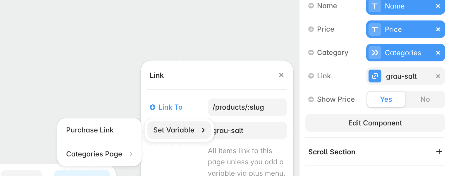
By default, product cards link to the product detail page. To link directly to the product purchase website, select the Product Card component (within Home Page > Product Grid > Products > Product) and click on the Link field on the right side panel. Clear out the current link, click on + Link To, then Purchase Link. Repeat this process on the Categories CMS page to link directly from the Categories CMS page as well.
Customizing Home Page & Form Submission
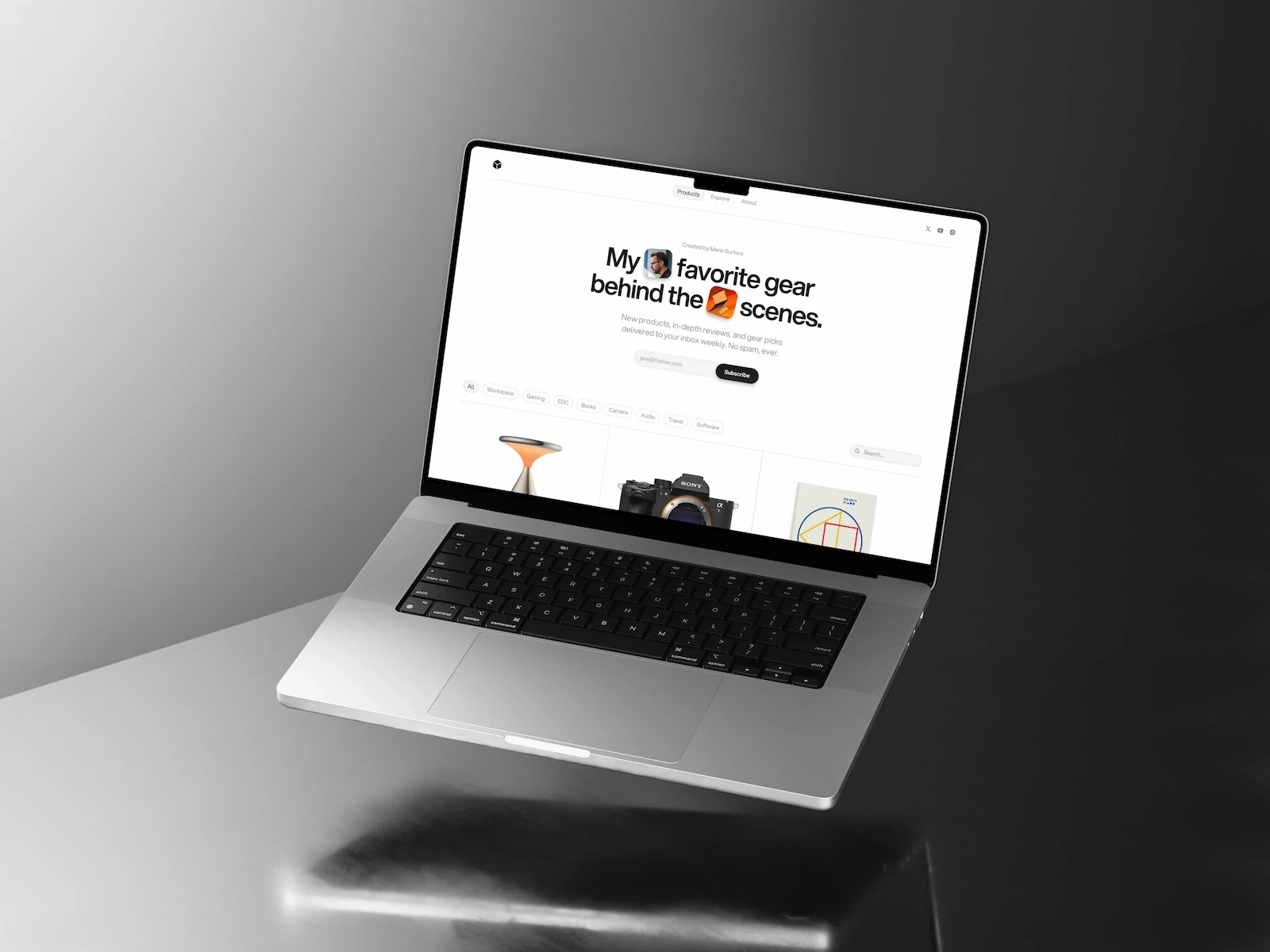
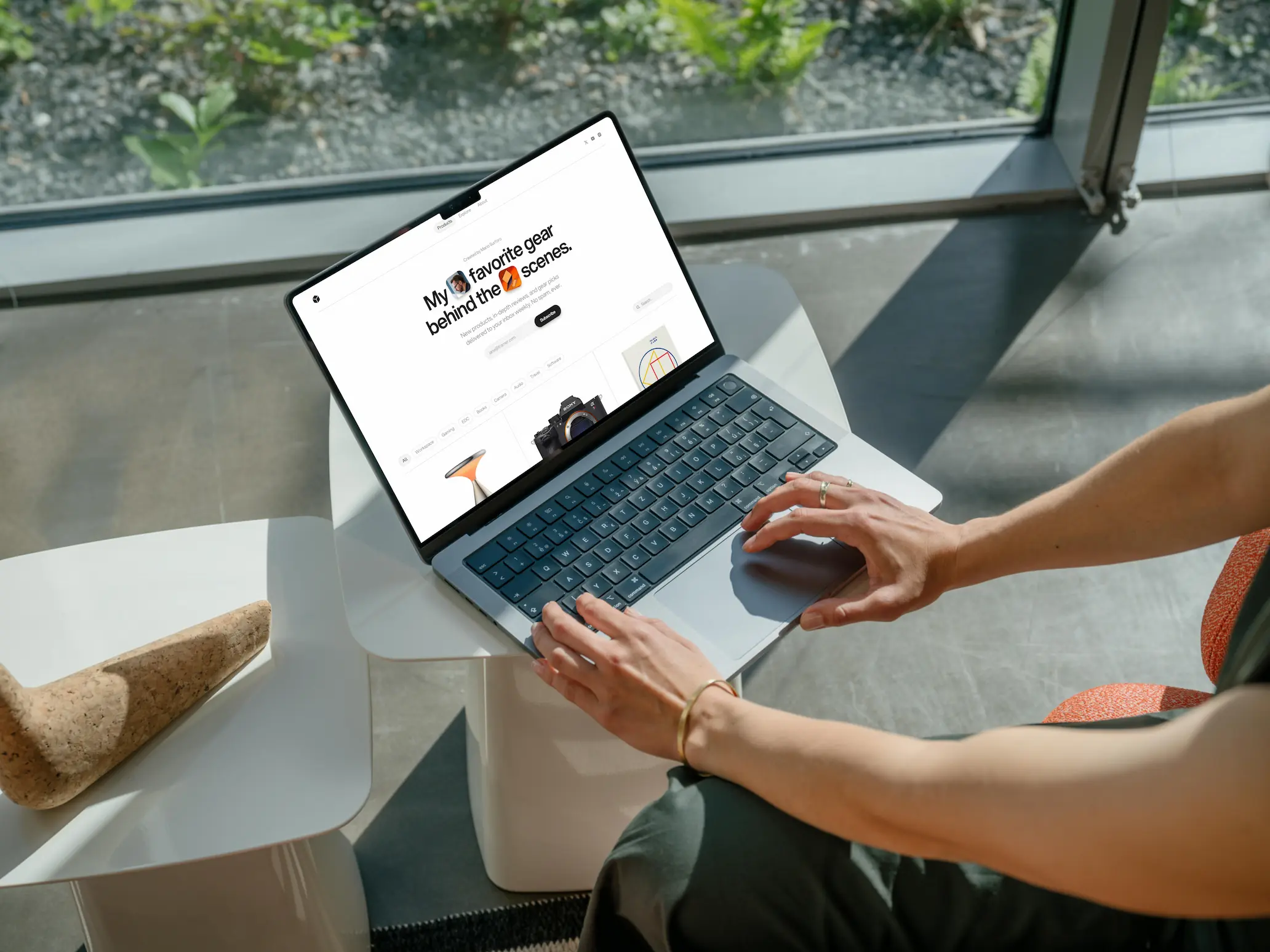
Editing the home page hero section is simple. Start by editing the eyebrow text (above the headline) and replace the two inline images with your own. Next, you can edit the newsletter signup text by clicking on the text box just below the headline. To setup the email submission, click on the Form layer on the left-side panel (within Hero > Hero Container > Form). From here, you can customize the way signups are handled by clicking Send To and selecting from Email, Webhook, or Google Sheet.
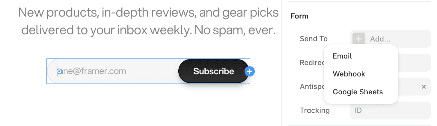
To setup email submission in the Footer, first double-click on the Footer at the bottom of the page. This will take you to the Layout Template. Double-click on the Footer again to enter the component. With the Desktop variant selected on the left-side panel, select the Form layer (within Top > Newsletter). From here, you can customize the way signups are handled in the same way.
Customizing Social Links
There are a few fields to edit in order to add your social links across the website. Have your social links ready, and double-click on the Nav Bar component from any page.
With the Desktop variant selected on the left-side panel, click on each Social Icon layer (within Main > Socials > Social Icon), replacing the Link field on the right-side panel with your social link for each platform.
Next, while still in the Desktop variant, click into Mobile (greyed out). Click on each Social Icon layer (within Mobile > Socials > Social Icon), replacing the Link field on the right-side panel with your social link for each platform.
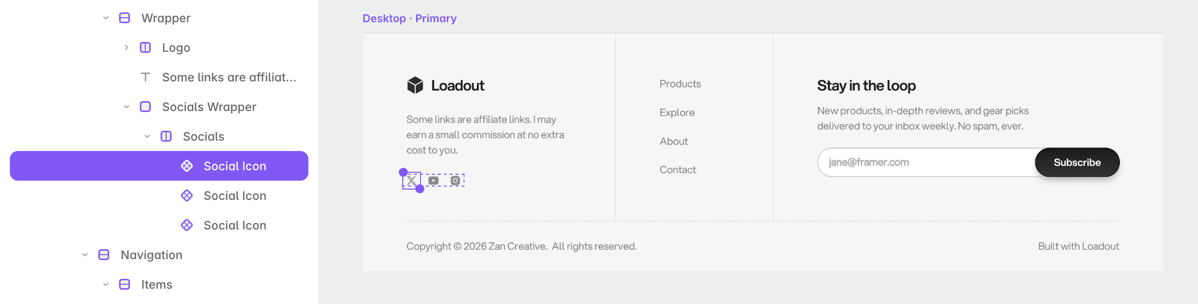
Go back to the Home page, and double-click on the Footer at the bottom. This will take you to the Layout Template. Double-click on the Footer again to enter the component. With the Desktop variant selected on the left-side panel, click on each Social Icon layer (within Wrapper > Socials Wrapper > Socials > Social Icon), replacing the Link field on the right-side panel with your social link for each platform. Make sure to also click on the Menu Item labeled Contact, and replace the Link with your own email (on the right-side panel).
On the About page, select each of the Social Link layers, replacing the Link fields on the right-side panel with your own social links.
Customizing About Page
To customize the About page, simply edit the default text on the right-side and replace the two default images on the left-side. Additionally, you'll want to replace the Signature image with your own, or delete it.